Modern Legend. Georgians pride themselves with centuries old traditions of winemaking. Archeologists date roots of cultivated grapevine back from 8,000 years ago. So we like to believe that this is where wine production first began – Wine culture being almost inseparable from country’s national identity. But when it comes to bottled wines, mmm, there is not much to show off. Most of the mainstream brands appeal to the tradition, but cannot compete with homemade and draft wines. That’s why, when GWS – leading wine producing company decided to launch new wine brand of 14 different varieties, we were faced with a challenge of establishing the tradition of consuming modern bottled wine. So, we decided to create a modern urban legend. Loudspeakers, Colors and Sounds of Music. Every wine variety has its own character – we started our thinking from this simple notion and went through studying scientific theories of Newton, Goethe, and finally, Scriabin to launch “vismino” with a unique experiment. We wanted to connect wine tasting with music, but also made sure that music would be involved in the creation of new wine on every stage.
Naming. The name “vismino” is translated to “have to listen” from Georgian, perfectly transmitting the essence of the brand, and inviting all ‘listeners’ to enjoy the experience.
Label Creation. We transformed an ordinary piano into “the labelmaker”.
Graphic Design. We placed the artwork on the label to serve as the main visual identity of the brand. “vismino” graphic mark is used as the brand logo, while each label also features additional graphic elements in shape of an unique sound waves, and QR codes, matching their respective music piece.
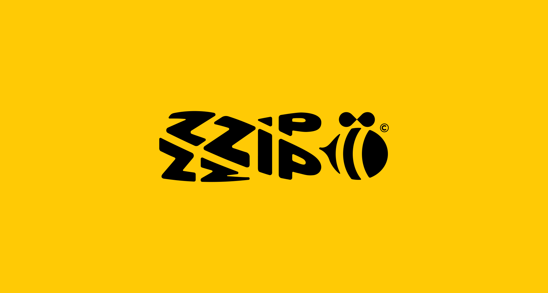
Frixx is a world-class brand of packaged potato chips, created by combination of foreign expertise and locally grown raw materials.
Naming:
We created a resonant name, which gives us an idea of brand character and the target audience – modern, joyful, free-spirited youngsters and ones who love to have fun with friends. The name is a combination of 3 words: Free + Fries + Freaks
Visual Identity:
In order to underline the origin of the brand, we put Caucasus mountains as the main object of the logo, together with the brand name and tagline Caucasus Chips (later changed to Caucasus Snacks). The main colors are brown and orange, which is the most organic color for chips category. As additional colors, we chose red and green, for use in print materials and packaging.
Packaging:
As for the packaging, we created 4 different designs for 4 different flavors. Final outcome is the result of numerous focus groups and shelf-impression tests.
After crafting branding and packaging design for four different flavors, we started working on a communication platform. We came up with a creative concept – For those who play – which later also became the brand tagline. As people usually eat chips with friends, in a relaxed atmosphere, at leisure, and the main target audience is youngsters, we decided to connect the brand narrative with playing and games. At the same time, we tried to bring back most of our childhood offline games, which nowadays are replaced and forgotten because of smartphones and the internet. We kicked off the campaign by introducing a web portal www.frixxfun.ge which is the first database of offline games.
Credits Executive Creative Director: Vato Kavtaradze Creative Director: Bibi Asatiani Copywriters: Hermann Szabo , Beqa Meparishvili , Nino Gordeladze, Achi Tsenteradze Account Manager: Tamar Tsintsadze Designers: Zakharia Metreveli , Tamta Malazonia Junior Art Director – Matasi Sulakauri Illustrator: Ivane Kipshidze Strategic Planner: Lado Malazonia Production & Post Production Manager: Natia Nikoleishvili
The rebranding of “Chveni Fermeri” (Our Farmer) a dairy product line of Nikora, one of the prominent local food producers and supermarket chains in Georgia were inspired by the simple fact – people tend to consume these products on a daily basis. That’s why we named the brand “DGIS” (in translation from Georgian – “daily”). The packaging of DGIS Products also reflects the idea of daily consumption, reminding a newspaper and telling a different and amusing story concerning a particular product (cheese, sour cream, yogurt etc.). Within the launch campaign, we also created a real newspaper instead of a typical flyer and made the regular buying process a little bit more interesting.
Credits
Creative Chairman: Vato Kavtaradze Creative Director: Bibi Asatiani Executive Creative Directors: Nino Gordeladze, Beqa Meparishvili Copywriters: Irina Sakvarelidze, Tsotne Mazmanishvili, Constantine Makharadze Art Director: Matassi Sulakauri, Mari Sukhishvili Account Team: Inga Svanidze, Tamar Tsintsadze Designers: Ruslan Beridze, Zakharia Metreveli, Natia Kvaratskhelia Chief Strategist: Lado Malazonia Research Analyst: Giorgi Sabadze Newspaper Editors: Matassi Sulakauri, Eka Zaitseva, Iko Sakvarelidze, Constantine Makharadze, Natali Burduli Newspaper Designer: Natia Kvaratskhelia Corrector: Lela Ochiauri
Creative Chairman: Vato Kavtaradze Creative Director: Bibi Asatiani Executive Creative Directors: Beqa Meparishvili; Nino Gordeladze Head of Design: Natia Kvaratskhelia Creative Group Head: Mari Sukhishvili Head of Digital: Nick Gvakharia Digital Creative Director: German Leon Senior Digital Copywriter: Nutsa Ninua Senior Digital Media Managers: Nato Belkania; Natia Zarnadze Digital Account Manager: Giorgi Azaladze Strategic Planners: Mariam Chkhaidze; Elene Gugushvili
Creative Group Head: Mari Sukhishvili Art Director: Luka Makharoblishvili Head of Design: Natia Kvaratskhelia Illustrator: Natia Kvaratskhelia Graphic Designers: Giorgi Borchkhadze; Nike Belskaya Animator: Giorgi Borchkhadze, Rezo Bokeria
Digital Design Team: Senior Digital Designers: Salome Tsikaridze; Sopho Jeiranashvili Graphic Designers: Nini Janjalia; Knini Tchalidze
Head of Digital: Nick Gvakharia Head of Social Media: Nato Belkania Senior Digital Copywriter: Kristina Avsarkisova Social Media Manager: Nata Uridia Head of Advertising: Natia Zarnadze
Client Service Director: Ani Dondua Account Managers: Giorgi Azaladze; Khatia Gogrichiani Strategic Planner: Mariam Chkhaidze
2 Nabiji is one of the leading local retailers with 250 markets all over the country of Georgia. The brand has always been promoting the idea of mindful shopping, encouraging its customers to spend their time and resources reasonably.
Though, we all know that saving is almost always a good idea, we still spend too much money on products – not because they’re genuinely worth it, but because of the super-cool ads; influencers and fancy packaging.
Having this simple insight in mind, we came up with an honest, humorous and a little bit self-ironic campaign – the brand emphasizes only functional benefits of the products and once again reminds its customers that ‘saving is smart’.
Askaneli VS and VSOP is a premium quality Georgian brandy made by the Askaneli Company – one of the country’s leading producers of wine and spirits. Our task was to come up with a bottle design that would express the elegant, but modern nature of the product, and help accentuate the drink’s rich, dark amber color.
Agency: Windfor’s Client: Askaneli
Creative Director: Nino Gordeladze Head of Art and Design Department: Teona Shelia Head of Design / Product Design: Natia Kvaratskhelia 3D Artist: Saba Kavtaradze Senior Account Manager: Mariam Gogodze
Photographer: Ika Khargelia Set Designers: Sopo Kharebashvili, Tamara Guliashvili
Distilled in accordance with the traditional technology, Askaneli XO is a truly unique product – dark amber-colored, aged 10 years, and perfect for celebrating special occasions. We were tasked with creating a brand new bottle design that would accentuate superior qualities of the drink, all while organically fitting with the rest of the line of Askaneli brandy products.
Concept
In the working process, a lot of thought went into making sure that the label was integrated into the rest of the packaging as smoothly as possible. The relatively thin and wide shape allows the bottle to be comfortably held with either one or both hands, without fingers covering the label. Apart from this, the label sticker is practically engraved into the bottle – a special indentation marks the placement section, strengthening the product’s overall premium feel. Askaneli XO packaging features a traditional pattern, similar to the one that can be found on other Askaneli brandy bottles – a nod to the brand’s and country’s rich history. Fully transparent, crystal-clear glass allows to flawlessly convey the beautiful golden-brown color of the drink.
Agency: Windfor’s Client: Askaneli
Creative Director: Nino Gordeladze Head of Art and Design Department: Teona Shelia Head of Design / Product Design: Natia Kvaratskhelia Label Design: Tata Megrelishvili Senior Account Manager: Mariam Gogodze
Photographer: Ika Khargelia Set Designers: Sopo Kharebashvili, Tamara Guliashvili
Askaneli is one of Georgia’s leading producers of wine and spirits, dedicated to preserving and perfecting the country’s traditional viticulture by using the best of modern practices. Having recently worked on a full rebranding process together, the company approached us with a new task: come up with a new bottle design for its line of premium quality brandy.
As we did with the brand’s visual identity, we wanted to somehow incorporate the rich history of Askaneli into the design. For this, we invented a unique pattern that echoed classical Georgian elements, found on traditional fabrics and bas-reliefs – the vine, grape bunch, etc. The bottle shape itself is designed to emphasize the elegant and sophisticated nature of the drink.
Agency: Windfor’s Client: Askaneli
Creative Director: Nino Gordeladze Head of Art and Design Department: Teona Shelia Head of Design / Product Design: Natia Kvaratskhelia Graphic Designer: Meko Tchikadze 3D Artist: Saba Kavtaradze Senior Account Manager: Mariam Gogodze
Photographer: Ika Khargelia Set Designers: Sopo Kharebashvili, Tamara Guliashvili